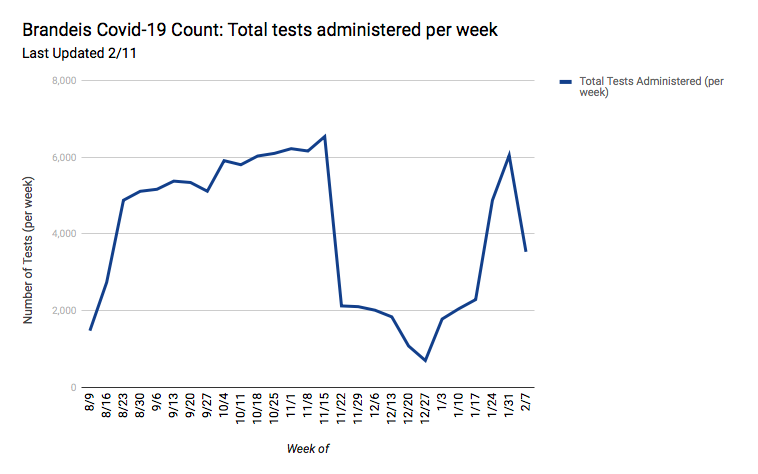
These graphs provide data collected from the Brandeis COVID-19 Dashboard. The first graph depicts the number of positive test results from the week indicated. Since the university has updated its dashboard to distinguish new coronavirus cases between students and faculty/staff, our Number of New Positive Cases graph now has two lines, one to represent new student cases and one to represent new faculty cases. The second graph shows the number of tests administered for the week indicated. It is important to note that students can be and often are tested more than once per week—meaning the second graph will not refer to unique individuals tested. These graphs will be updated every Thursday with the most accurate information available. Please note the date of when the graphs were last updated.


